Eatscape
As a challenge, I wanted to create a brand from scratch that captured my current interests. I decided to set myself a brief to design a coffee bean delivery service in the style of Norse mythology, using different attributes such as the runic designs and mythological creatures.
I started by designing the logo that would be the main, eye-catching part of the brand. I created a Viking face, including a helmet with wings and a long beard (which I created by adding separate strips to resemble the runic designs). I wanted to use the negative space to fill in some details such as where the eyes and mouth would be. I then added the Rune for Tyr on top of the helmet to symbolise the brand name. I chose this name, as Tyr was a Norse god and it has a simple but effective sound. I used a clean, serif font that supported the clean logo.
Once I had a logo and typeface I was happy with, I started to create the labels that would be used on the coffee bags. I started by using a dark brown as the base, allowing the white logo and text to pop. I then added runic patterns in the corners, which makes the labels look tribal. Underneath the logo and brand name, I added the name of the blend in the appropriate colour, as well as the roast level signified by dots and information about the beans.


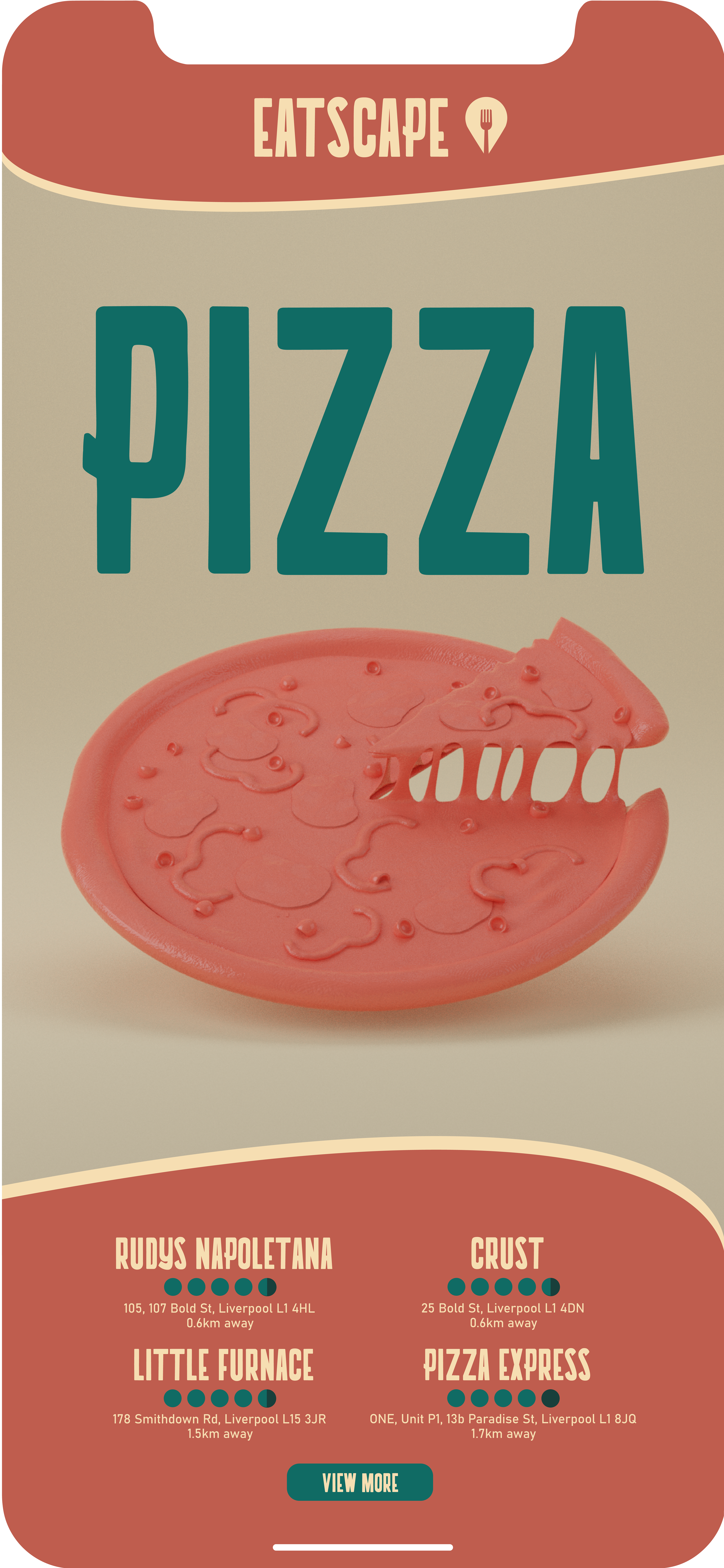
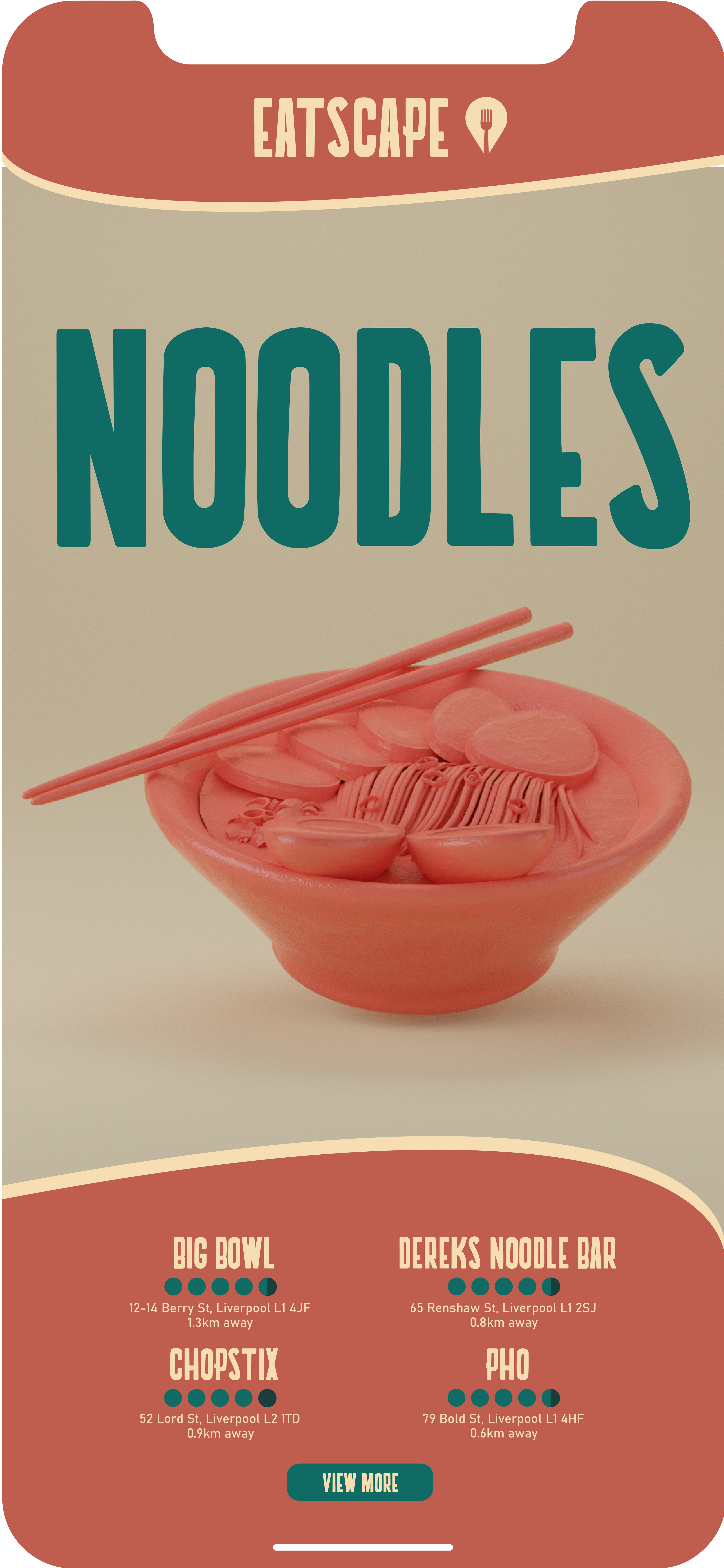
Once I had a logo and typeface I was happy with, I started to create the labels that would be used on the coffee bags. I started by using a dark brown as the base, allowing the white logo and text to pop. I then added runic patterns in the corners, which makes the labels look tribal. Underneath the logo and brand name, I added the name of the blend in the appropriate colour, as well as the roast level signified by dots and information about the beans.
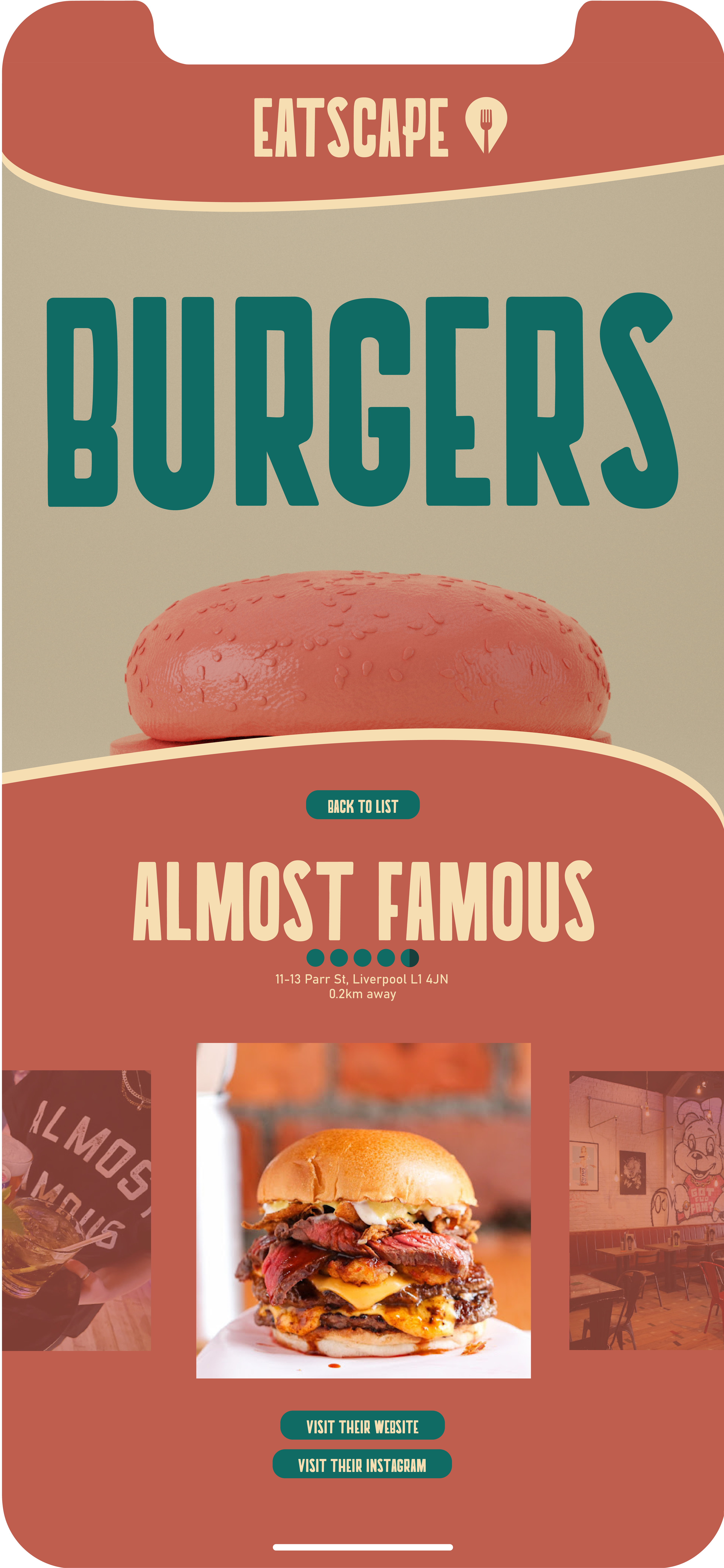
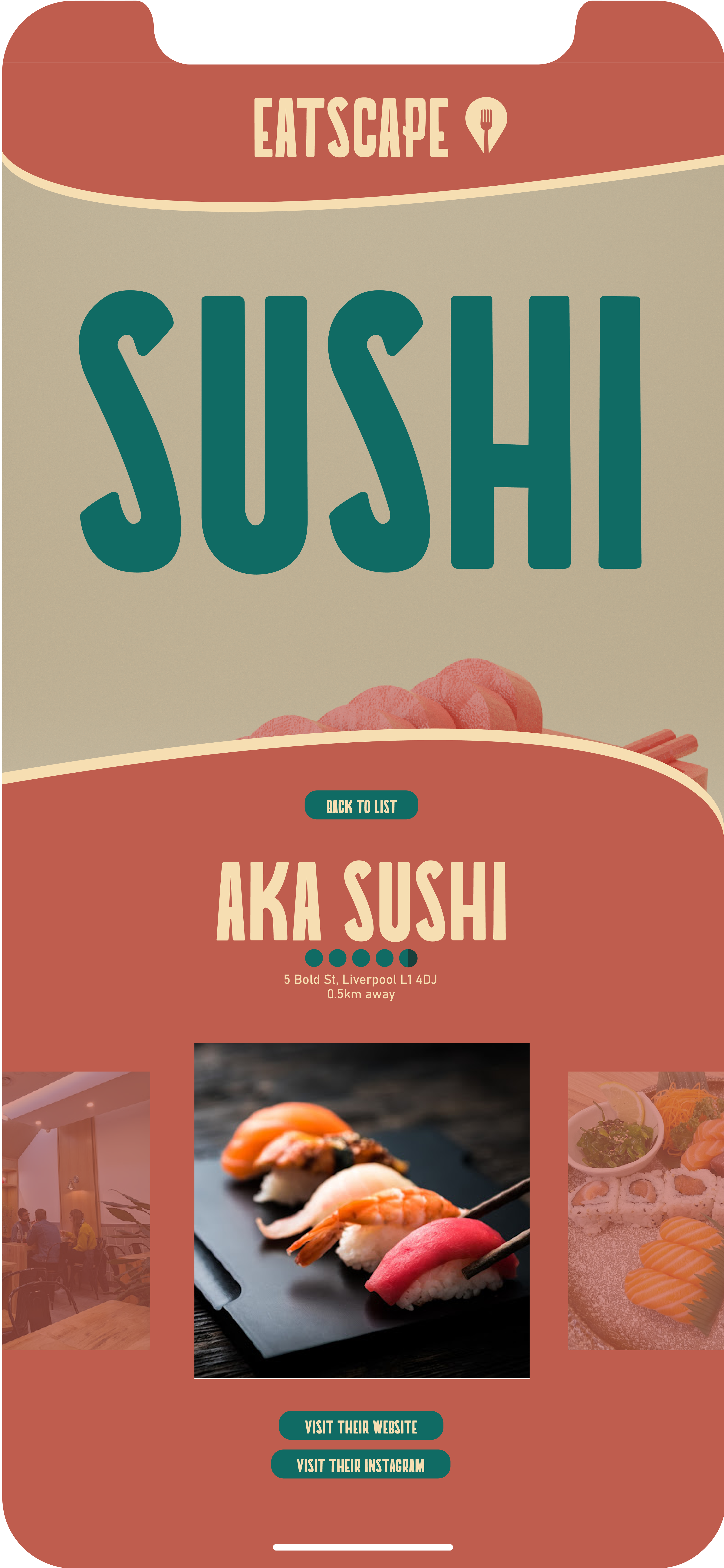


Once I had a logo and typeface I was happy with, I started to create the labels that would be used on the coffee bags. I started by using a dark brown as the base, allowing the white logo and text to pop. I then added runic patterns in the corners, which makes the labels look tribal. Underneath the logo and brand name, I added the name of the blend in the appropriate colour, as well as the roast level signified by dots and information about the beans.
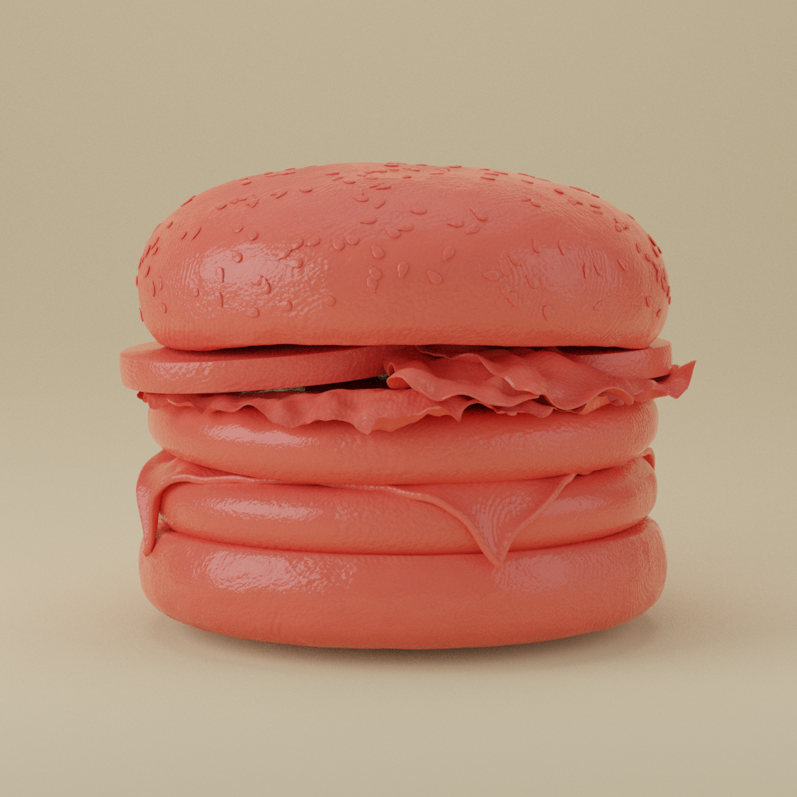
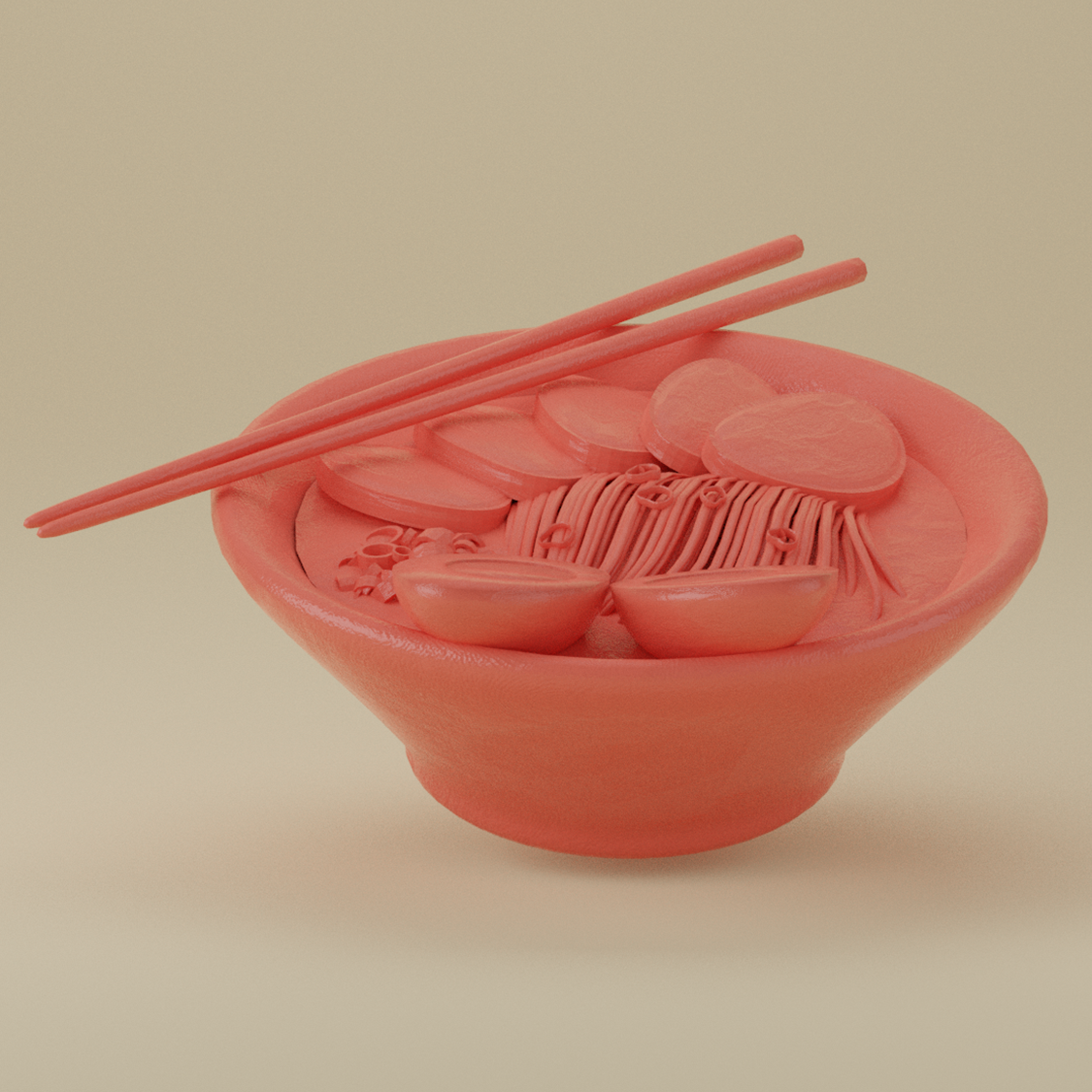
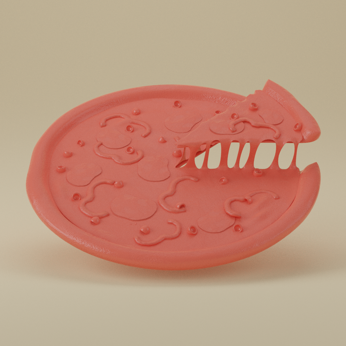
Once I had a logo and typeface I was happy with, I started to create the labels that would be used on the coffee bags. I started by using a dark brown as the base, allowing the white logo and text to pop. I then added runic patterns in the corners, which makes the labels look tribal. Underneath the logo and brand name, I added the name of the blend in the appropriate colour, as well as the roast level signified by dots and information about the beans.
