TYR COFFEE DELIVERY
As a challenge, I wanted to create a brand from scratch that captured my current interests. I decided to set myself a brief to design a coffee bean delivery service in the style of Norse mythology, using different attributes such as the runic designs and mythological creatures.
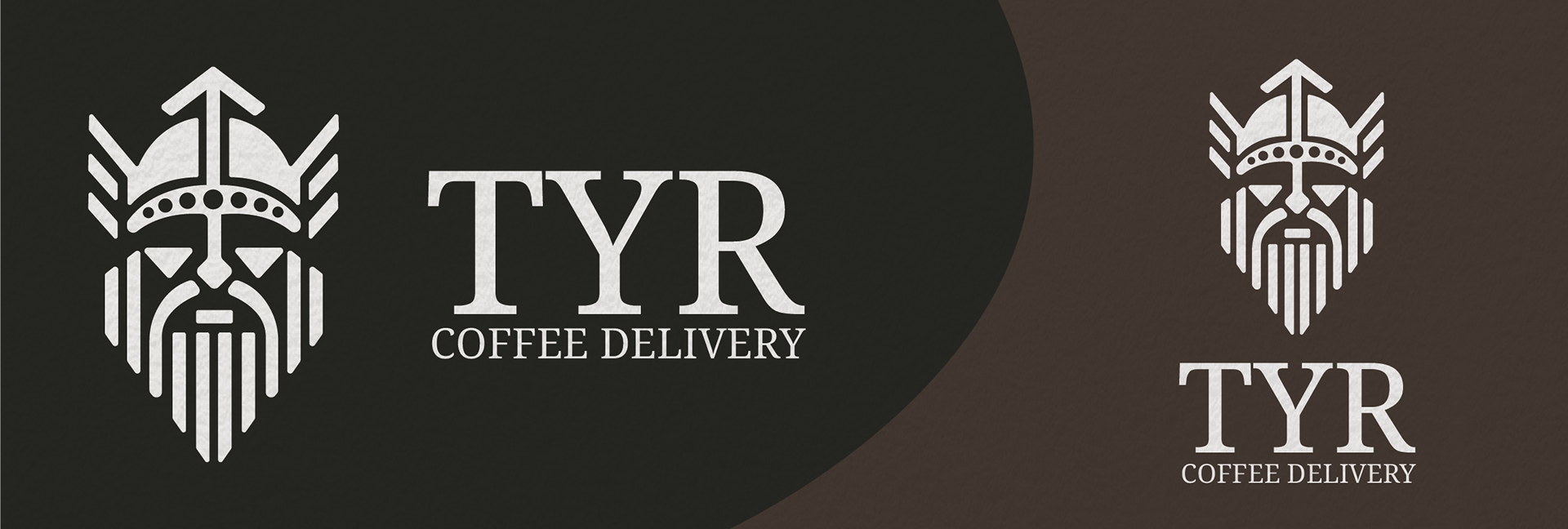
I started by designing the logo that would be the main, eye-catching part of the brand. I created a Viking face, including a helmet with wings and a long beard (which I created by adding separate strips to resemble the runic designs). I wanted to use the negative space to fill in some details such as where the eyes and mouth would be. I then added the Rune for Tyr on top of the helmet to symbolise the brand name. I chose this name, as Tyr was a Norse god and it has a simple but effective sound. I used a clean, serif font that supported the clean logo.
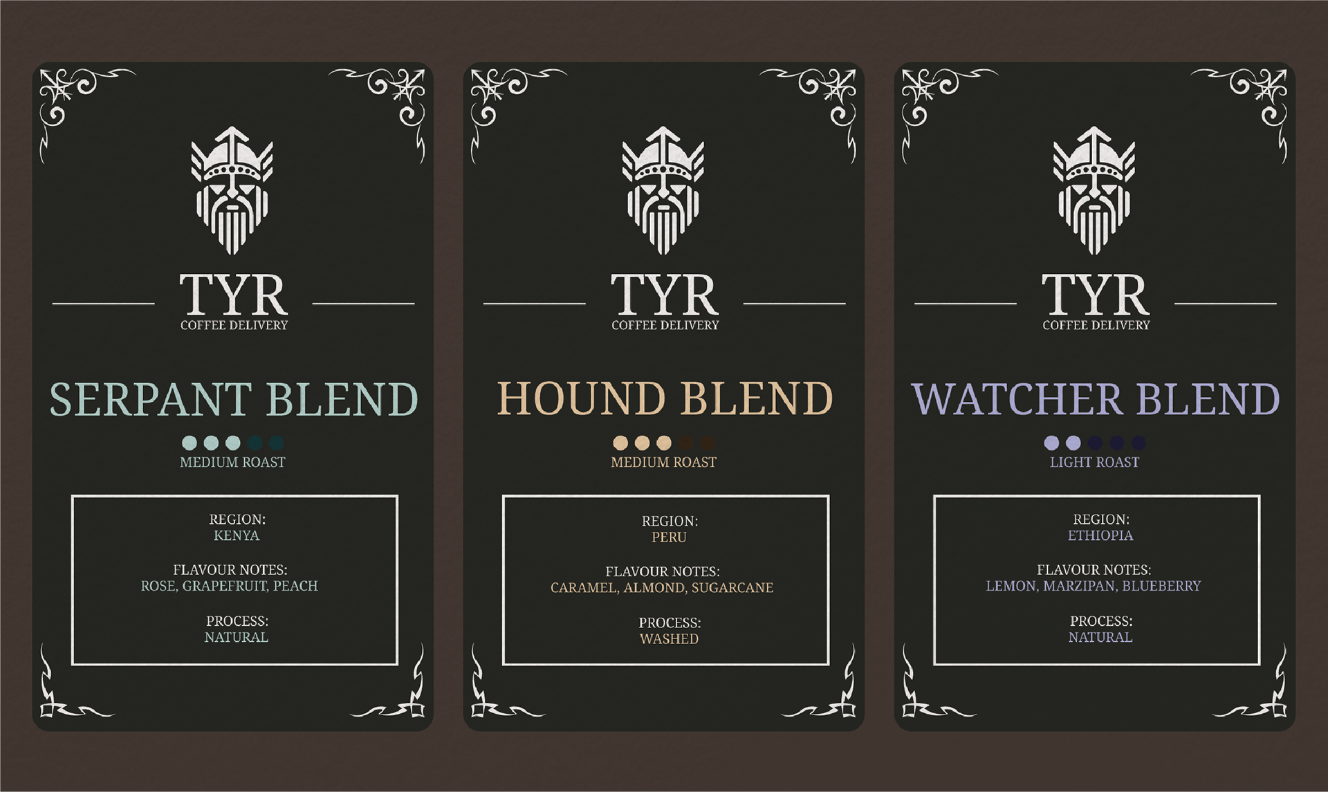
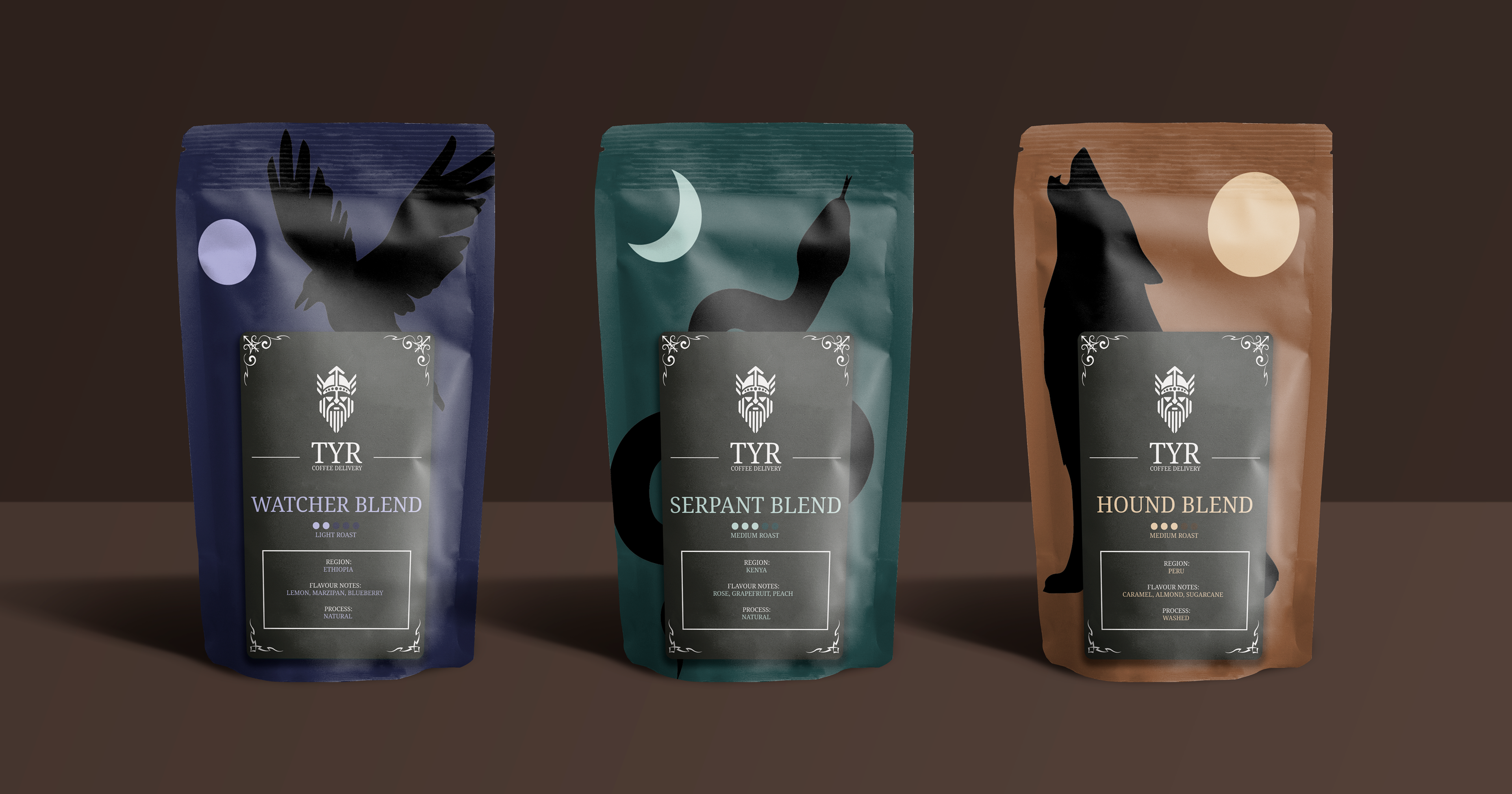
Once I had a logo and typeface I was happy with, I started to create the labels that would be used on the coffee bags. I started by using a dark brown as the base, allowing the white logo and text to pop. I then added runic patterns in the corners, which makes the labels look tribal. Underneath the logo and brand name, I added the name of the blend in the appropriate colour, as well as the roast level signified by dots and information about the beans.
I then designed the packaging, which I kept very simple as the labels had a lot of detail to them. I used a solid colour for the background and then added a silhouette of the animal that corresponded to the blend name. These animals represent the mythical beasts in Norse mythology (Raven, World Serpent and Fenrir). The colours I chose for the bags links with which animal is on it. I added the label on top, which fits perfectly, showing off the right amount of each animal.
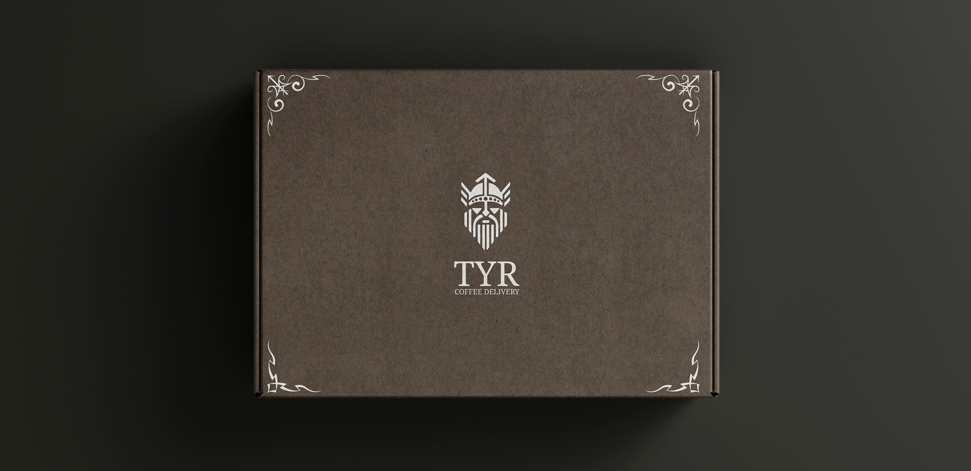
To go along with the packaging for the beans, I also created a mock-up of what the box would look like that the beans are delivered in. I kept this very clean and simple, using the logo and brand name in the middle of the box so it's easily recognisable. I also added the runic patterns from the labels in each corner of the box to link to the rest of the designs and add some more detail.
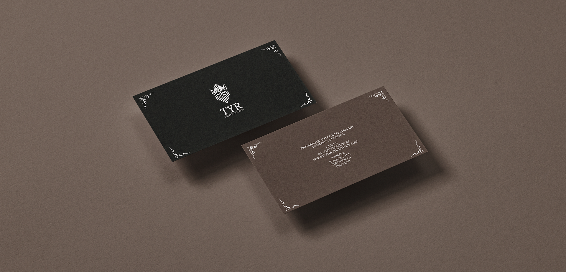
I finally created some business cards that would either be given out or placed in the box with the coffee beans. Similar to the delivery box, I kept the design of the business cards very clean and simplistic, adding the logo and text information in the middle of the card, as well as using those same runic patterns in each corner of the card. The very dark brown and the slightly lighter brown contrast well and work together.