SportsWear design (RCC)
Alongside my freelance work, I also currently am a manager at a sports clothing company, where I design, adjust and print shirts for teams and companies, as well as oversee the team. All the designs shown below were created by me for clients that had an idea but didn't know how to execute it. I use Adobe Illustrator to create the patterns on the print templates, keeping the print quality as high as possible when scaling up and down (because of vectors). I then save them as print-ready files and send them to the large scale printers, making sure everything runs smoothly.
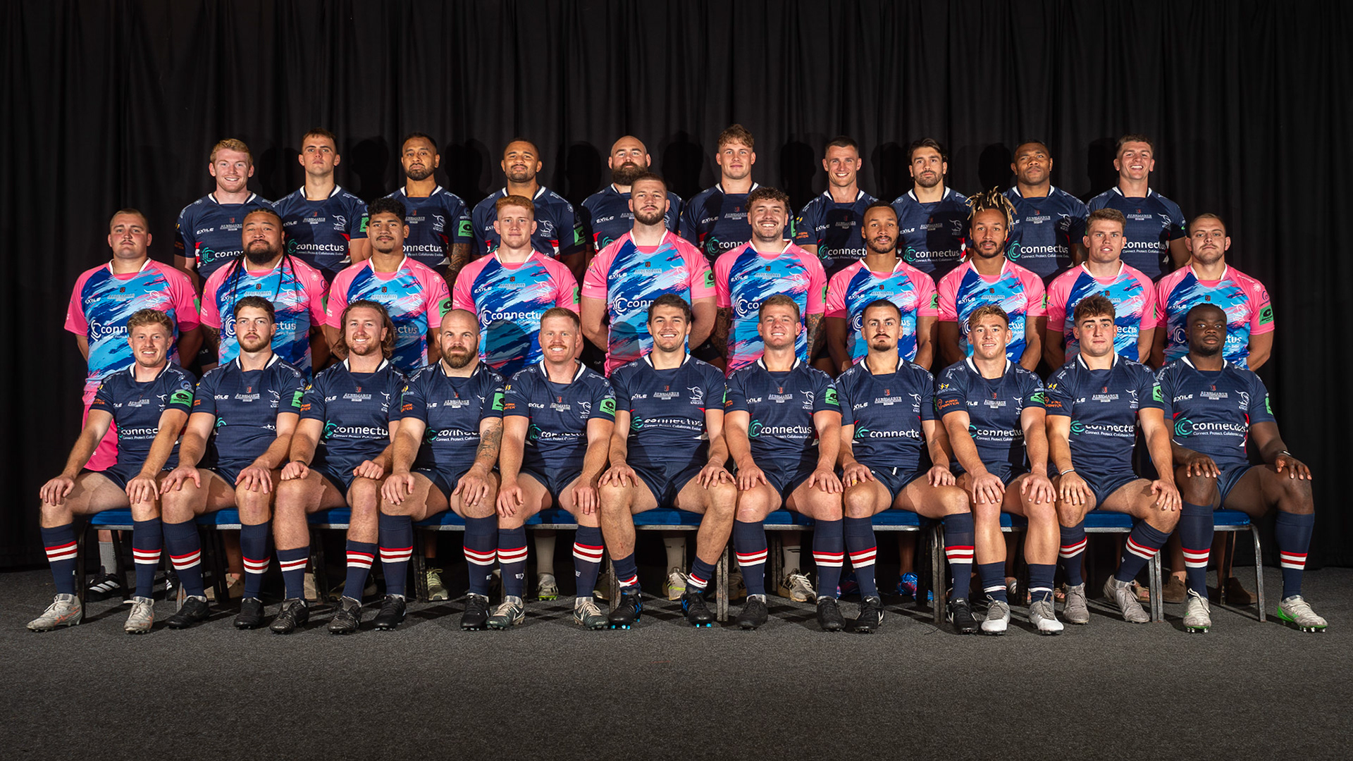
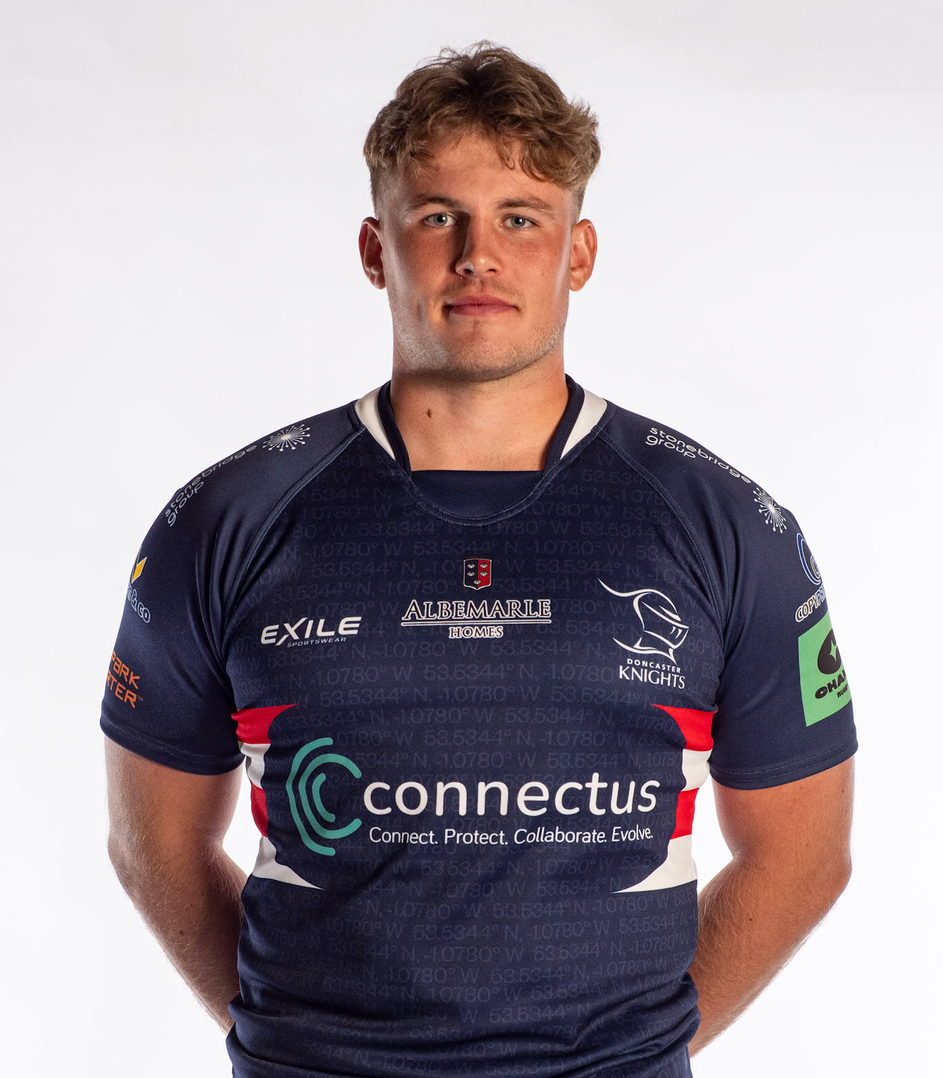
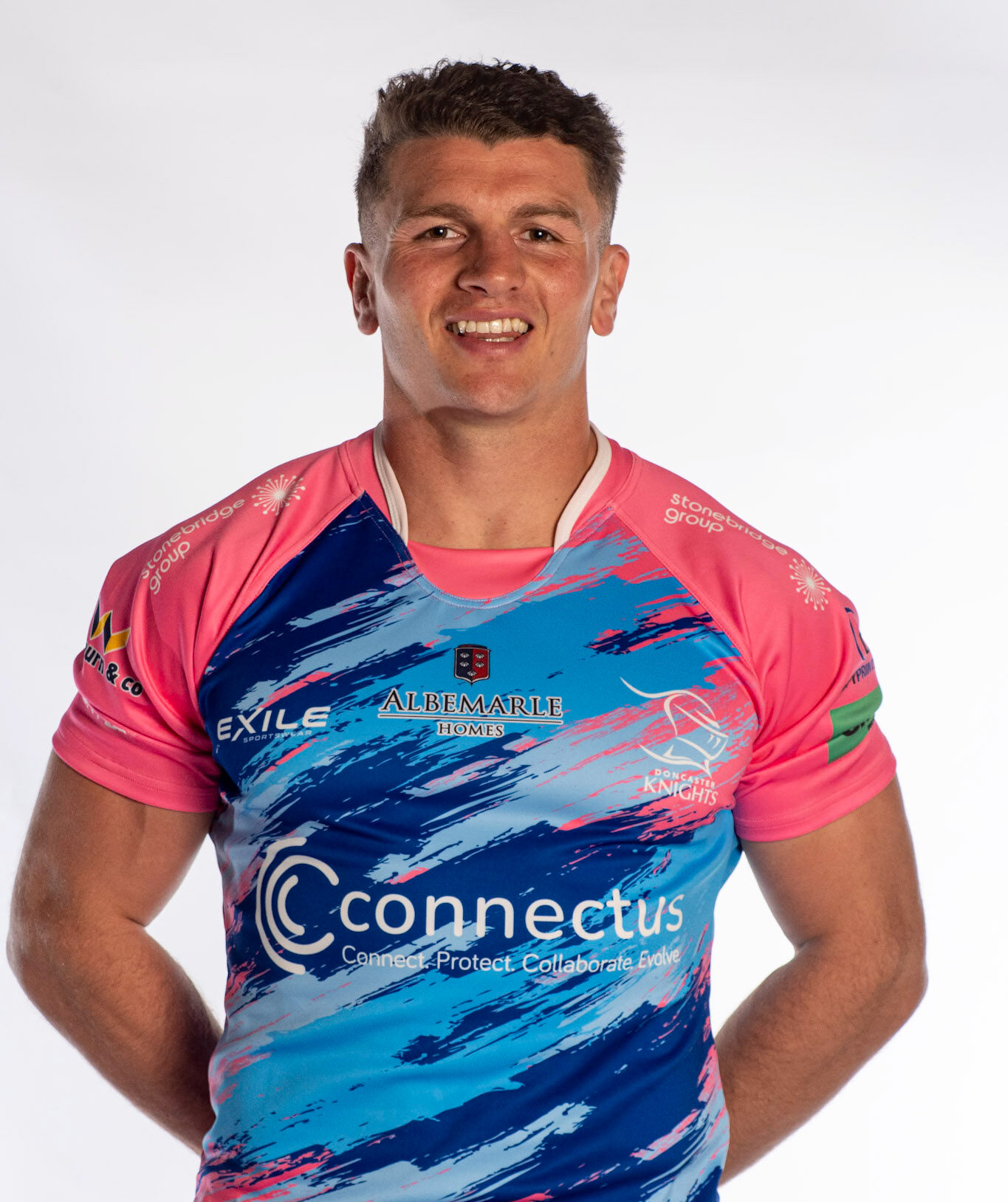
Doncaster Knights 1st XV Team (Home & Away Kits)
We were approached by a client to print and produce the new 1st XV kits. We started with the artwork and set it up as efficiently as possible to make sure printing was quick but at it's highest quality. The image above shows the whole team photo branding the new 1st XV. Below is a few player shots showcasing the kit up close.
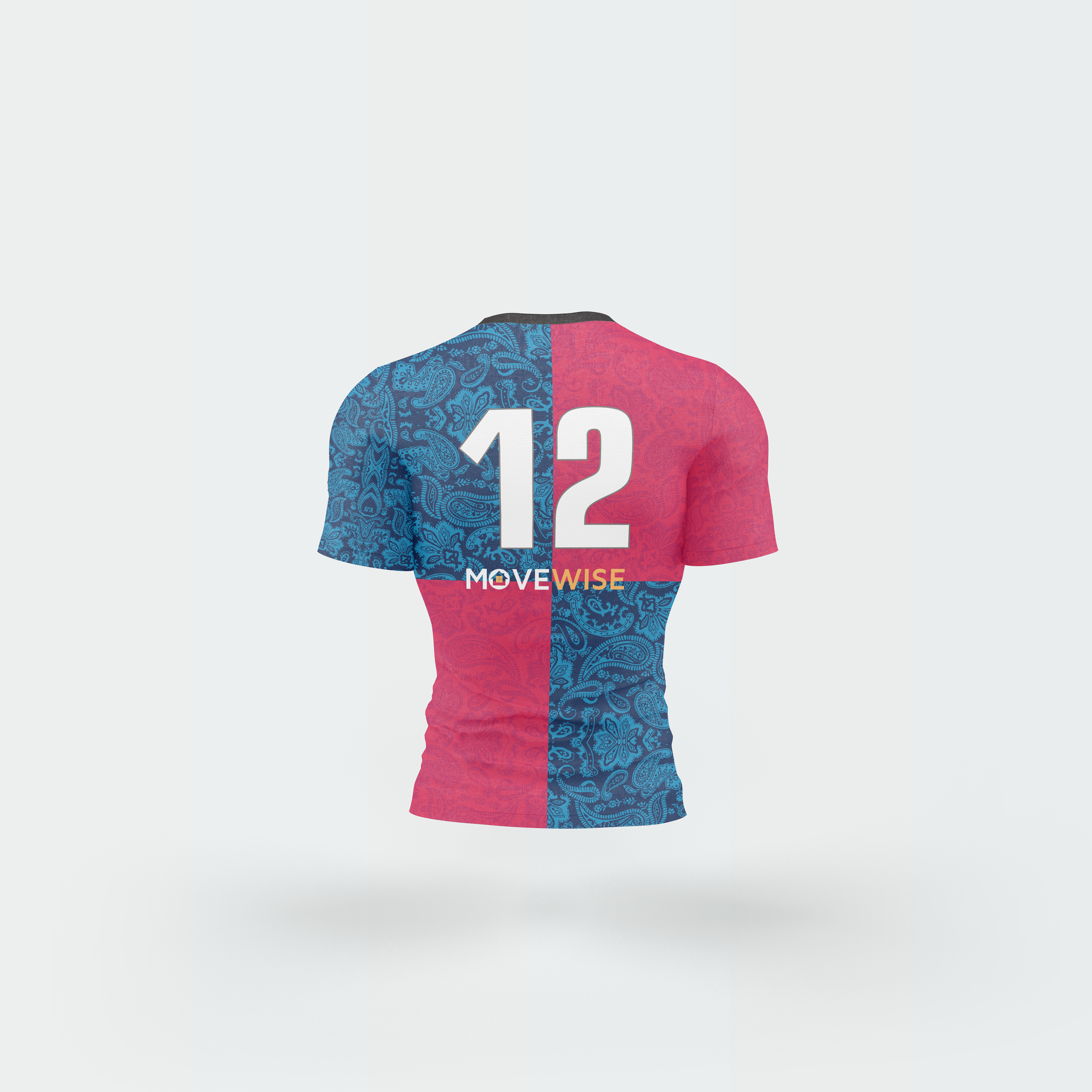
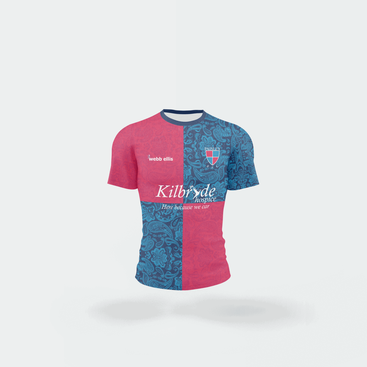
Paisley 1st XV
The shirt shown below was a very intricate design that the client wanted to showcase. They wanted a sharp contrast between the two colours so I used a bright red and blue (to match the teams badge). The sponsors provided fit well aesthetically on this shirt, not adding too much colour over the bright shirt design.

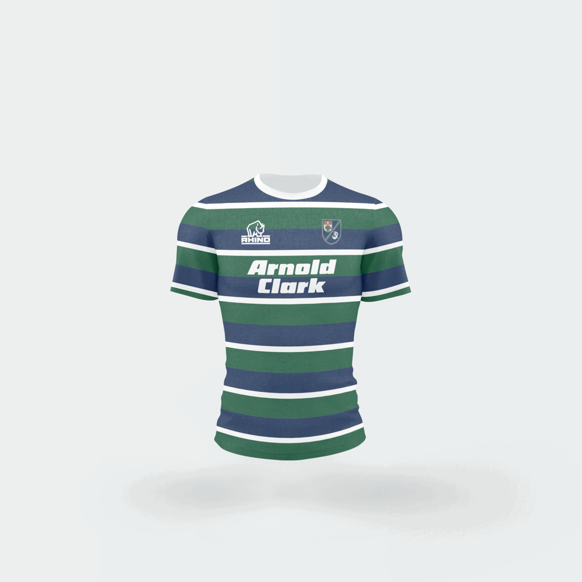
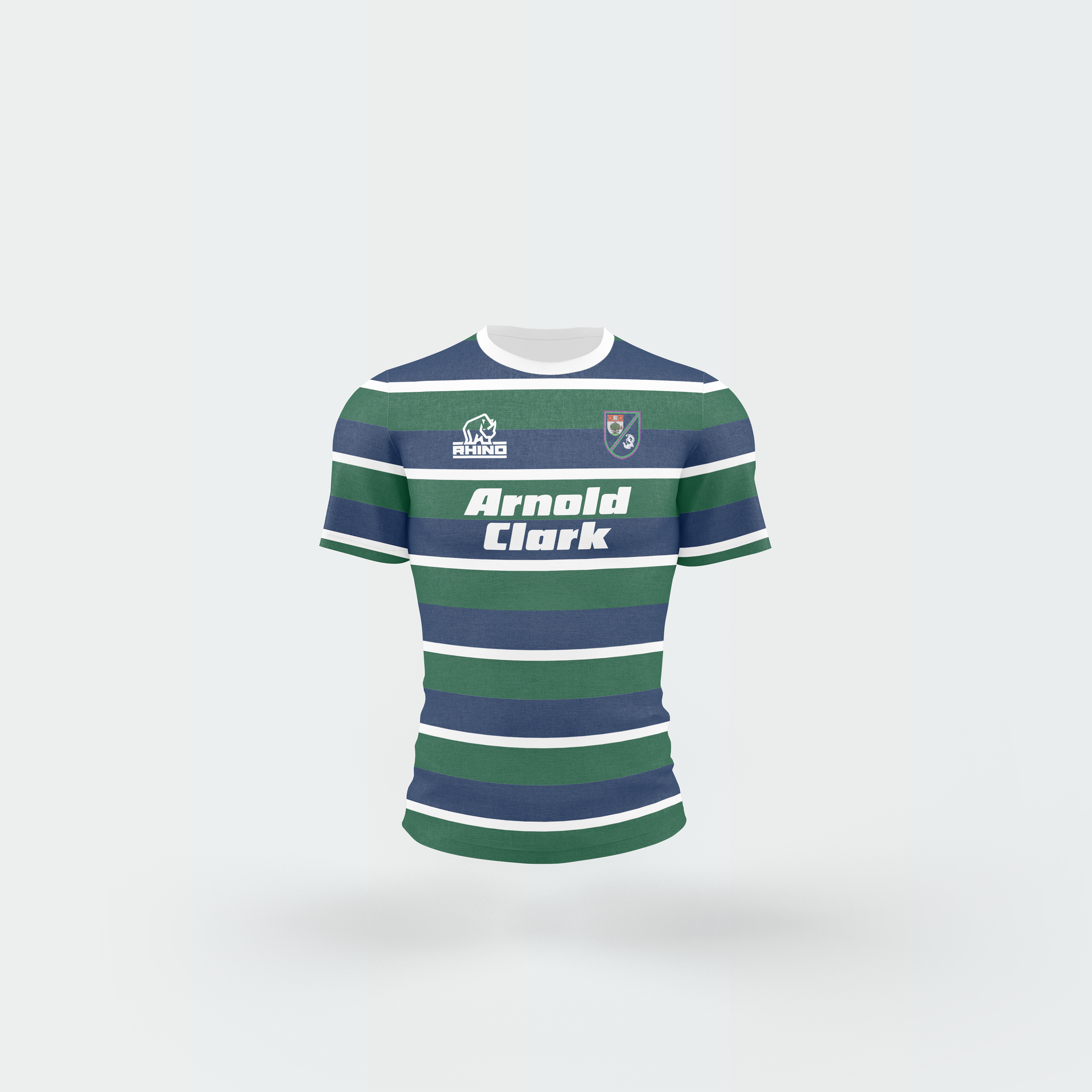
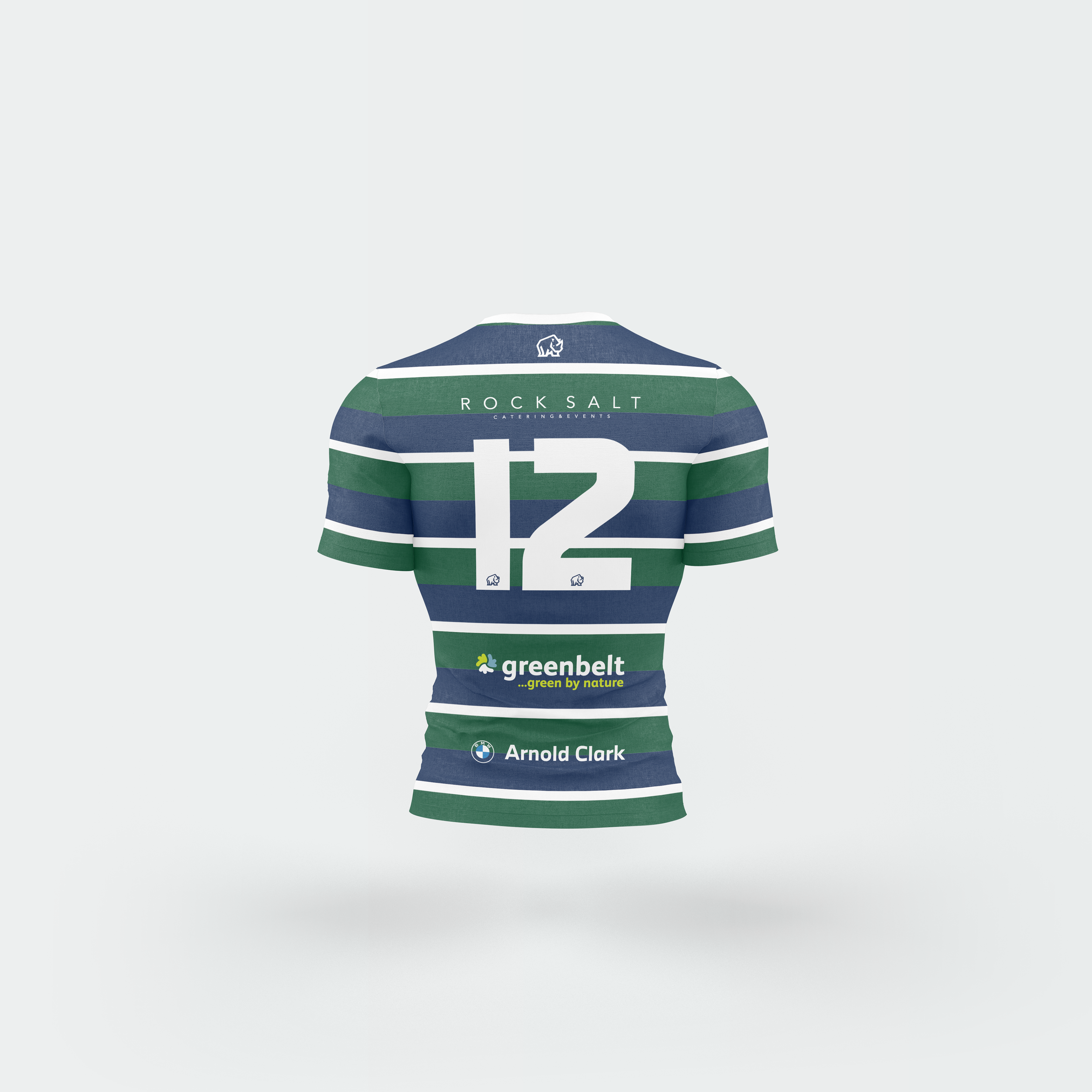
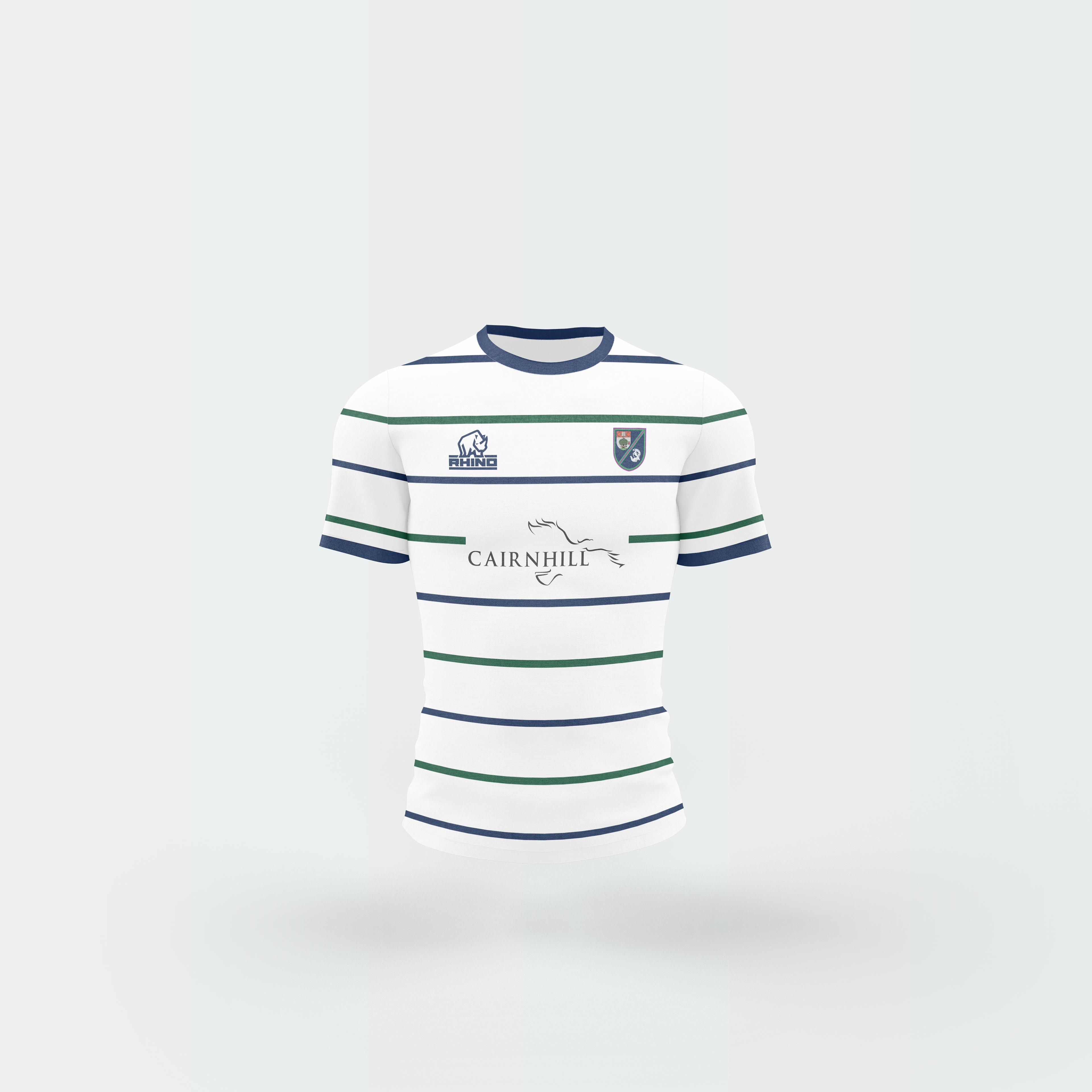
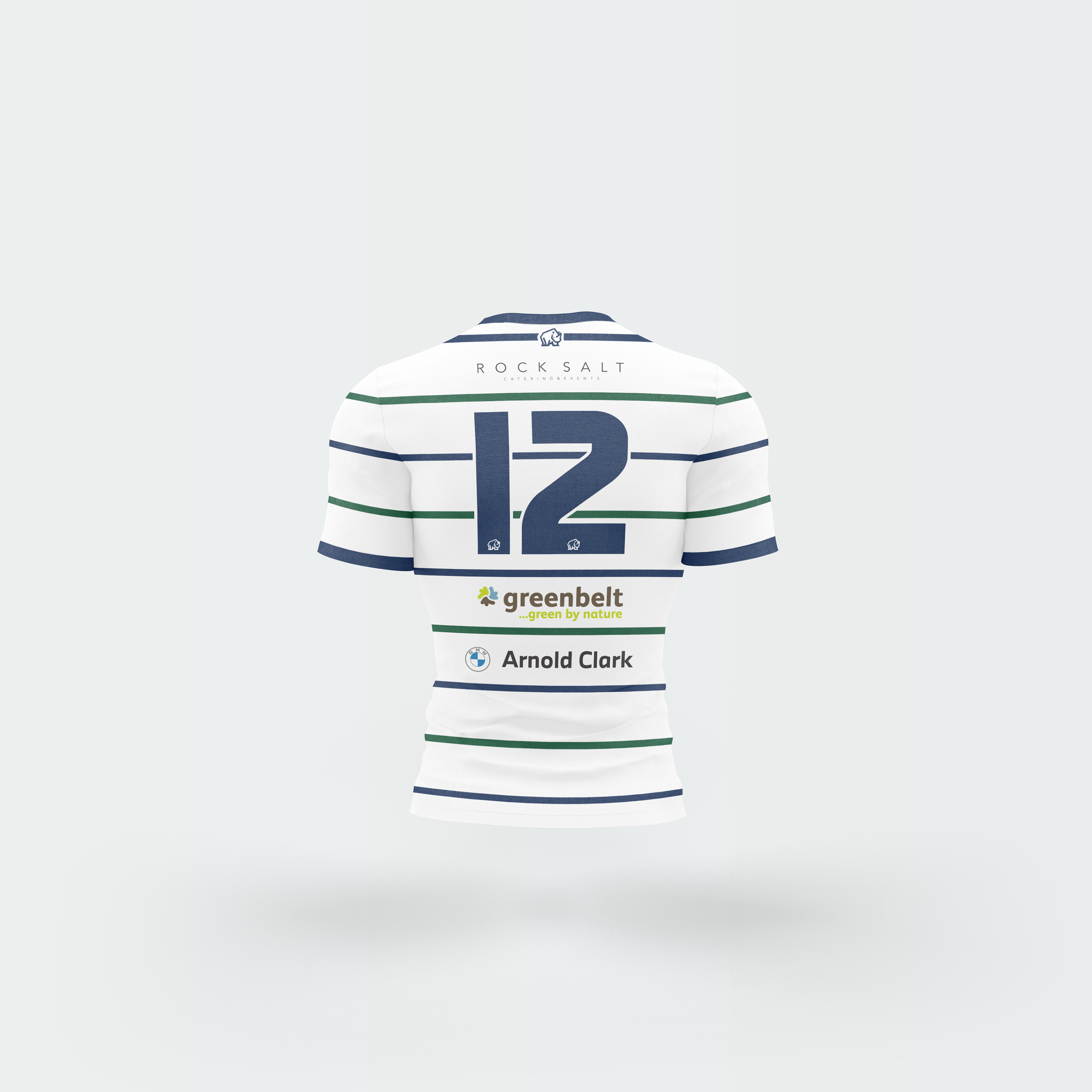
Glasgow High Kelvinside (1st XV Home & away)
This shirt design, although quite minimal in appearance, was quite a challenge to design. The client wanted the stripes on the sleeves to match the body, so I had to adjust my design on the print templates so that when the sleeves were sewn to the body there would be a continuous line. The colours used for this compliment each other so well, and the stylish white sponsors fit this shirt design perfectly.
Underneath this is the GHK away kit, which starts with a white base and uses the blue and green from the home kit for lines that go all the way up the front and back. Again, I matched the sleeves for this shirt. The back uses the same sponsors (but converted to black so they're visible) and the front simply changes to a different logo.
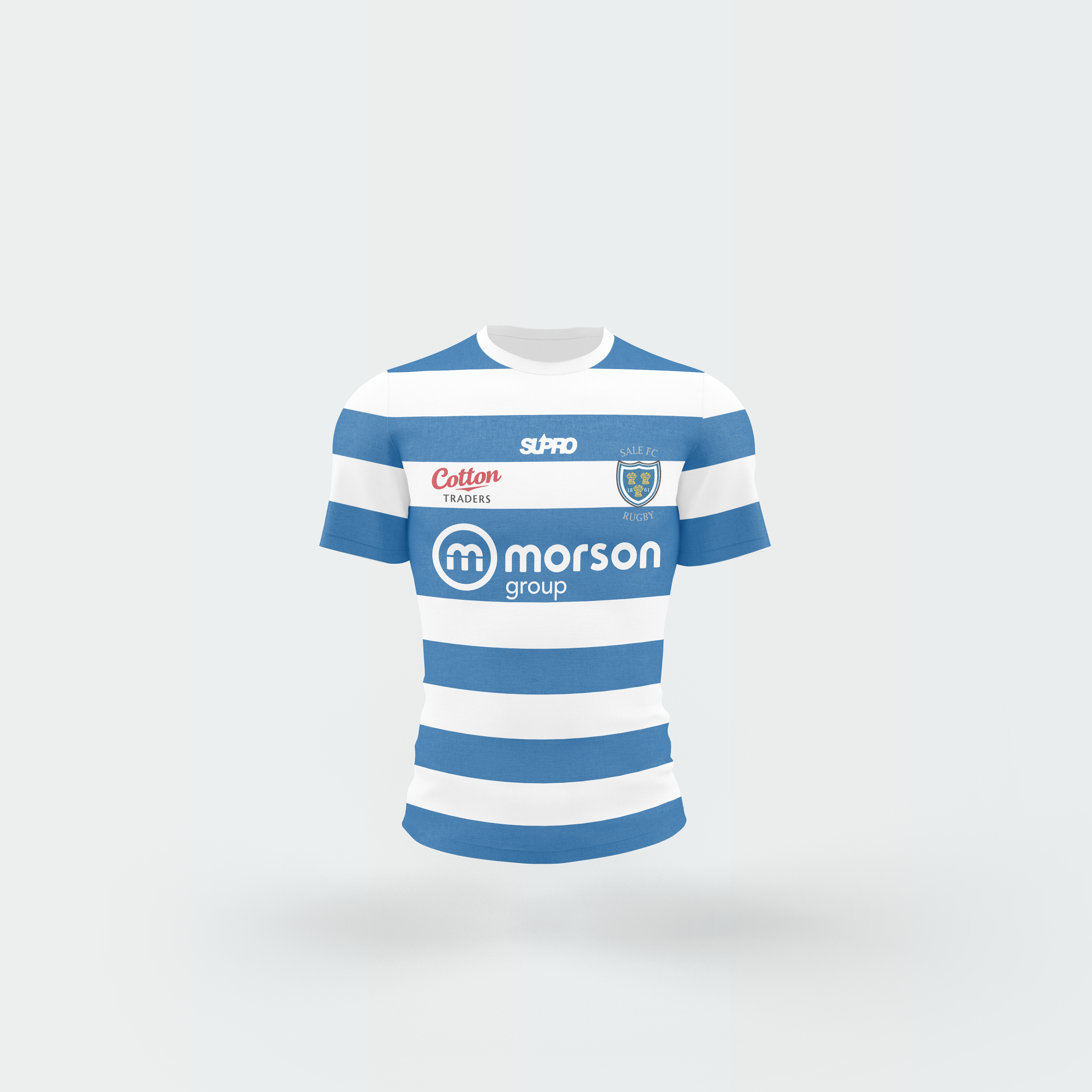
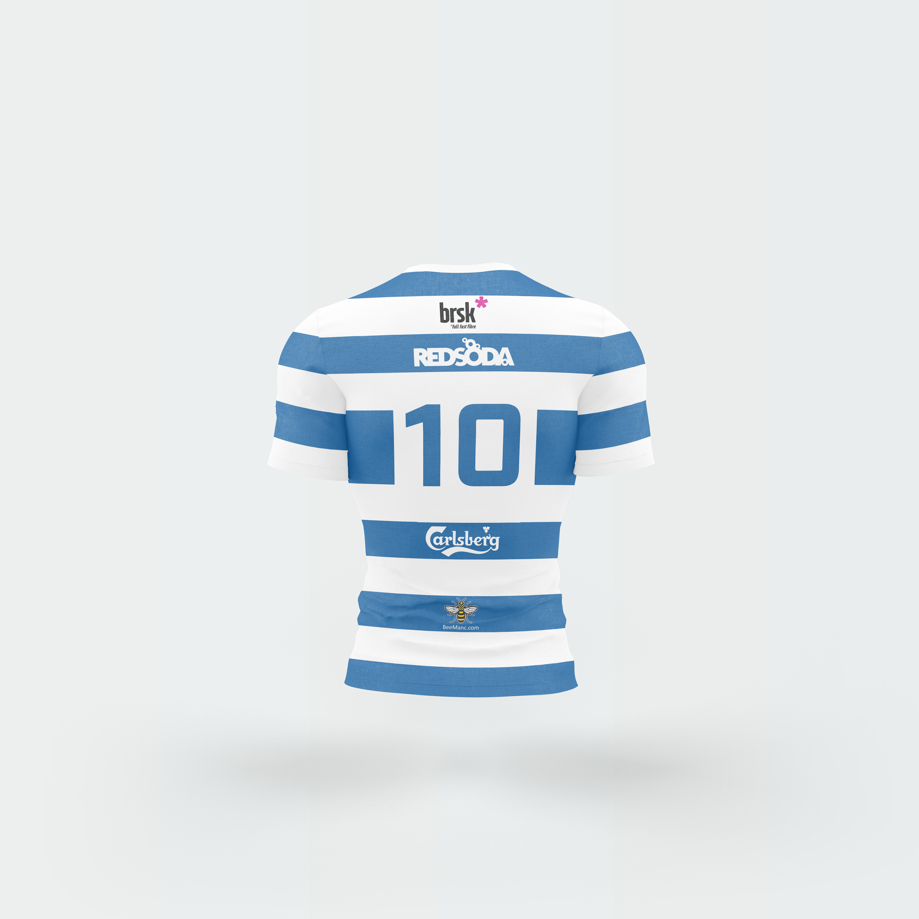
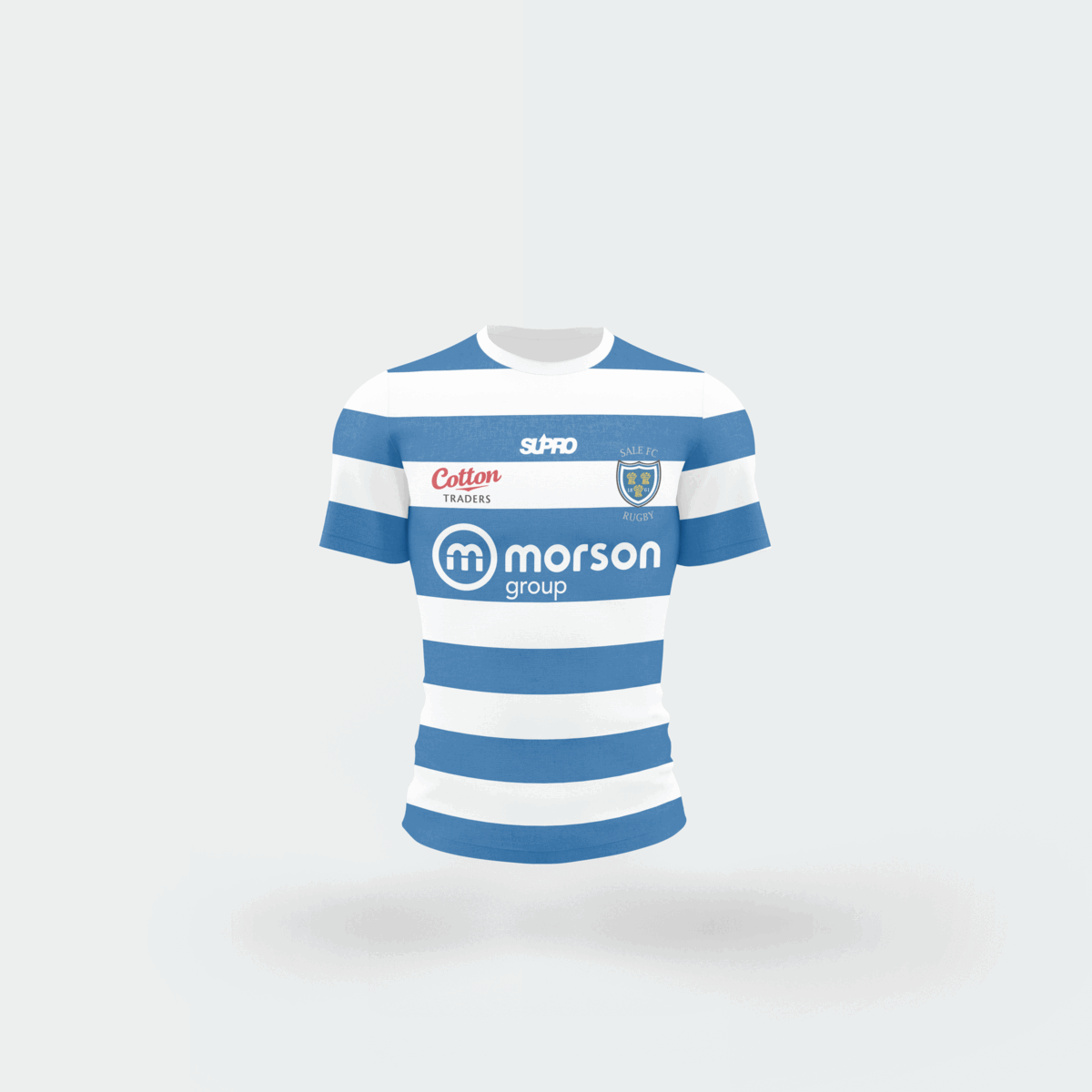
Sale RFC
For this shirt, the client asked for a classic rugby kit design. The thick blue strips work really well for this, keeping the design simple yet effective. Again, I had to match the stripes on the sleeves to the body of the shirt, giving it a consistent look. For the number on the back, I added a white box behind, which is another classic rugby shirt asset. With a lot of white sponsors again, it links perfectly with the white strips down the shirt; the red logo on the chest contrasts with the blue on the shirt really well.